How to Match the COLORS of Your Heart
Jul 01, 2025
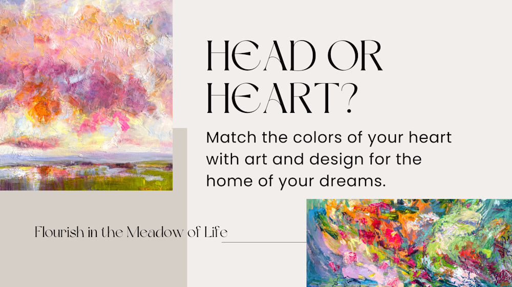
Finding the work of art that you love, that you will enjoy for many years to come, begins with matching it to the colors of your heart! This is counter to what most people expect. So let me guide you through the process.
To help you find art that you will be thrilled to design your home around, we’ll start with two collectors I worked with recently. We’ll call them Sam and Gene.
Sam said she was drawn to my jewel colors and envisioned designing her whole apartment from her new painting. Gene said he wanted a four by six foot painting for the great room, that would be seen from the entry foyer.
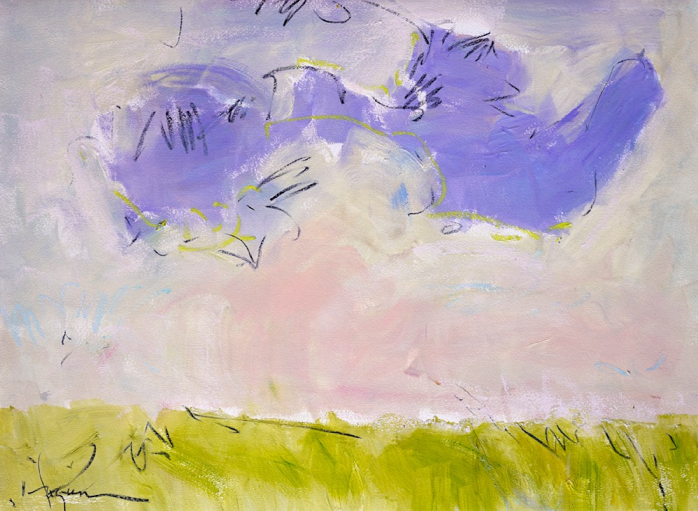 Cloud Nine
For Sam, I prepared a selection of jewel colors paintings and sat down with her on zoom to explore which resonated with her most. She shared with me that she had let go of her collection of pastel artworks. We chatted about the difference between a pastel palette and jewel tones.
Bless This Splendid Moment
Jewel colors, teal, verdigris, purple, gold, coral, vibrant translucent sparkling hues that resonate deeply feel grounded. Pastel colors are the SAME colors ~ mixed with white or complimentary hues. This diffuses the deep resonance of the wavelength of light reflecting off the surface. Pastel tones feel ethereal. With a stillness all their own, pastel colors harmonize the vibrance of life.
Discovering Your Palette
My Sunrise and Sunset palettes illustrate the difference. SUNRISE PALETTE colors are filled with gentle hope for what is to come. SUNSET PALETTE colors deeply resonate with peace and satisfaction of the day complete. These two palettes are the cornerstone of my art, of nature’s healing light. There are times when the heart craves stillness. And also moments where only deep vibrant resonate expression cuts through. Flourishing in the meadow of life requires both.
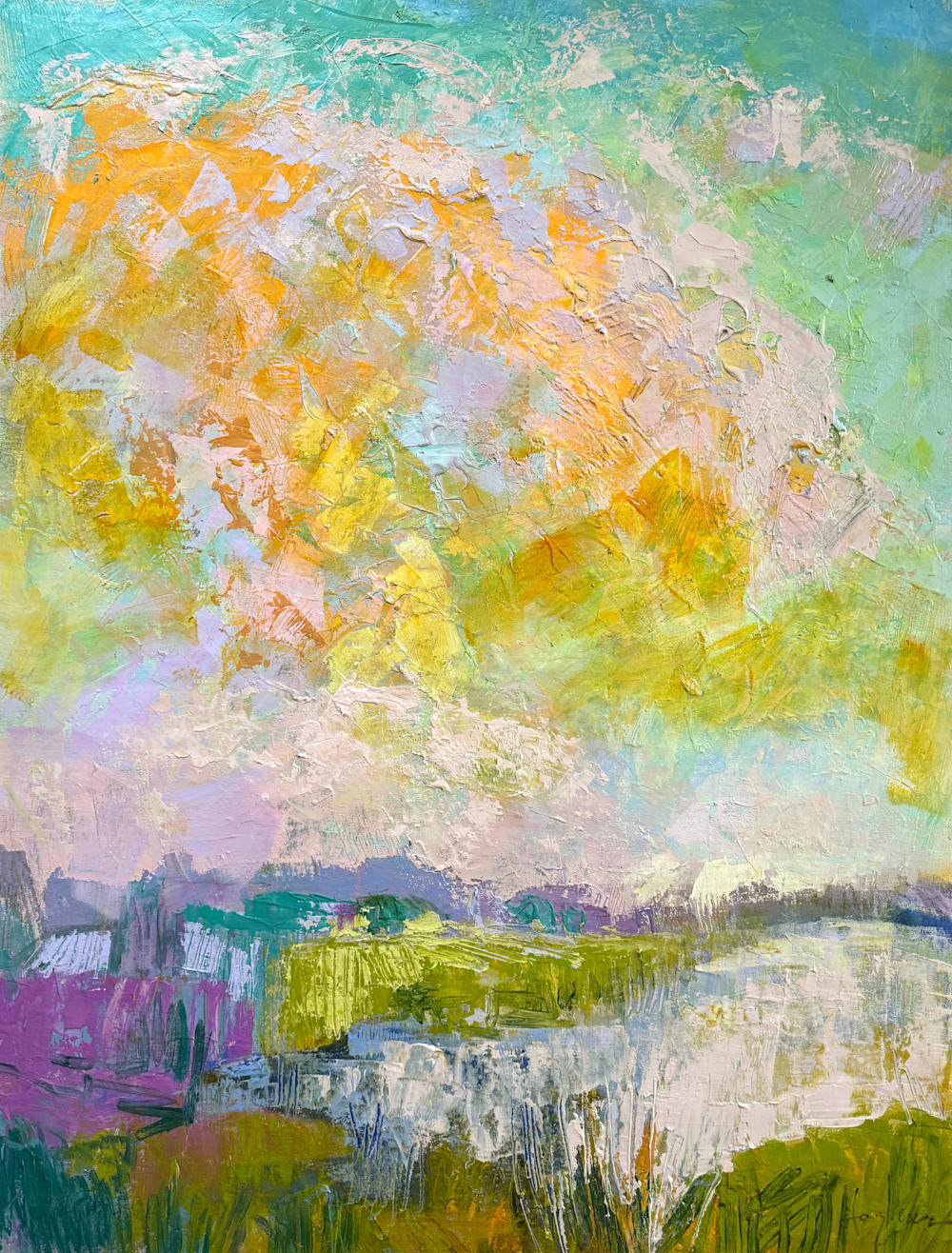 Soar Among Stars
SOAR AMONG STARS is a wonderful example of my Sunrise Palette. A full range of colors, orange, yellow greens, blues, and lavenders ~ all in gentle yet radiant glow. Not monochrome or flat, my Sunrise Palette feels gently uplifting, hopeful. Indeed, some of the colors reach to the depth of what one might call jewel.
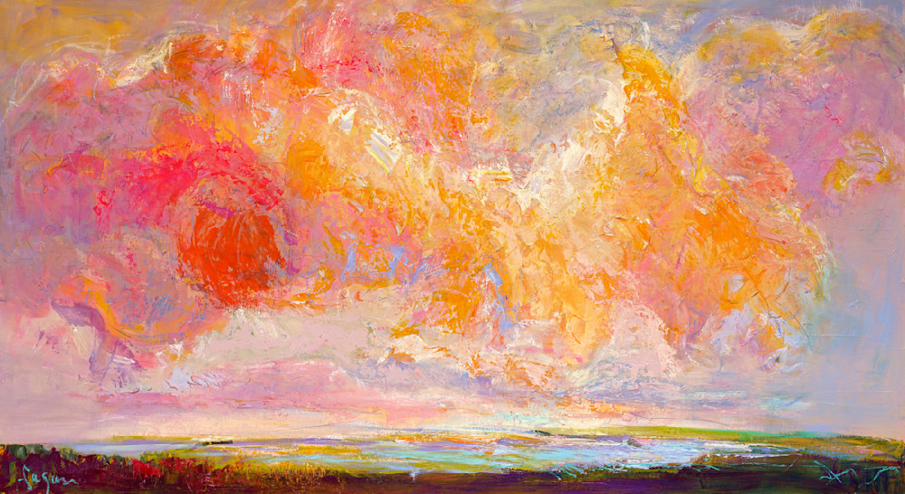
With a Happy Heart
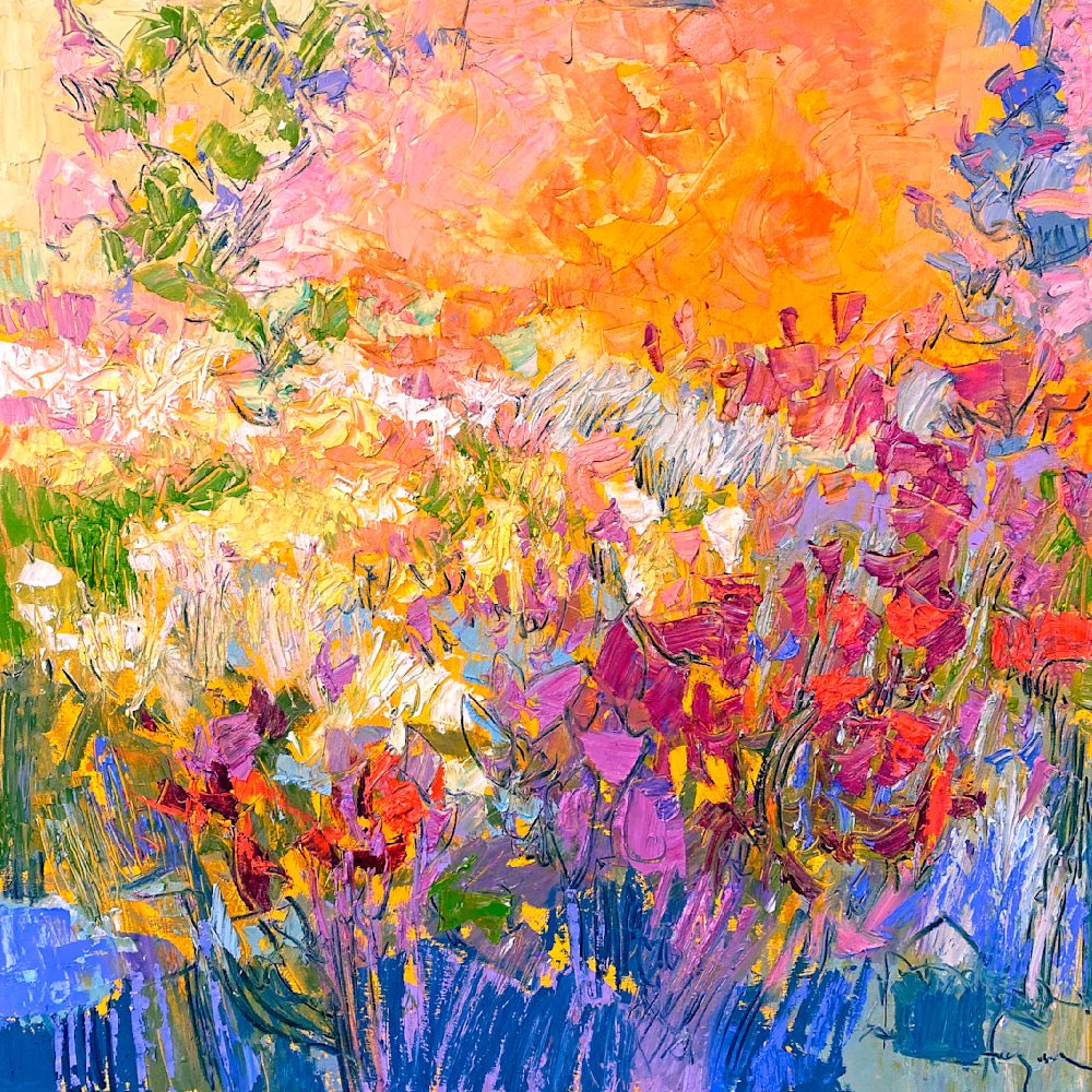
WITH A HAPPY HEART is a wonderful example of my Sunset Palette. A full spectrum colors, leaning more into the jewel tones. Radiant reds, orange, yellows, deep shadow violets ~ yet balanced with pastel tones. Most people lean in one direction or the other, pastels or jewels. Create your own unique balance and harmony with a combination the feels right for you. To give yourself a range, lean into more of one or the other in different areas of your home, day, or season.
The BIG Question of Size
The biggest mistake people make is selecting something TOO SMALL. The other big mistake people make is leaving the space blank for years, not knowing where to start. A large painting makes the room feel bigger! This is especially true for the main focal point artwork.
TRY THIS> To determine which wall is your focal point wall, stand at the entrance of your home/room and scan the room to see where your eye is drawn?
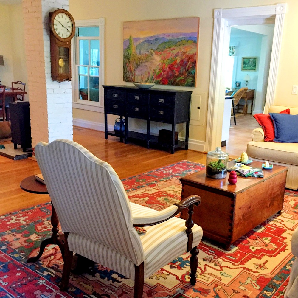
This photo was taken standing in the entrance foyer, looking into the living-dining room. The painting over the buffet was painted to fit the exact space where a mirror had been hung to cover the electrical breaker box.
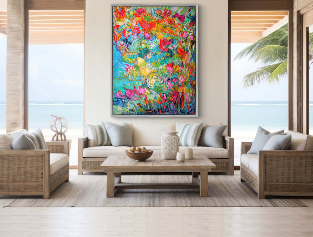
 The Meadow II
Gene began with the size of the painting and the wall he envisioned it hanging. He described the vantage point from which the painting would be seen. He did what I do when envisioning what will look spectacular in a client’s home. Together we stand in the doorway and look at the space entering the room.
TRY THIS> What is the first thing we see as we enter your room? … your home?
Gene described his room with a large focal point wall in the great room, with large windows along the adjacent wall, across from the main entrance. A quick FaceTime walk-through with him told me almost everything I need to know, including his concern about how we might incorporate a small dining nook tucked into an adjacent space. Get help with selecting your painting>
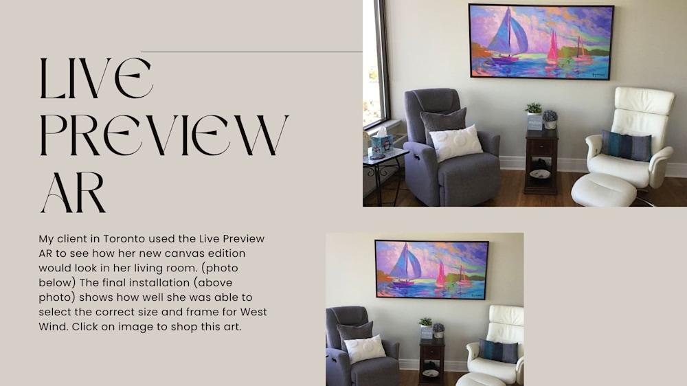
TRY THIS> To envision your selected painting on the wall of your home, use the Live Preview AR on my website with your device. You will find it below the art image on every limited edition art listing. Follow the on-screen instructions to view it on any wall in your home.
While it’s easy to identify paintings that will fit the physical space ~ the real issue is discovering the balance of jewel and pastel colors, grounded and ethereal hues feel like home in the heart and soul. My process for helping people do this is one I have developed over years of designing art, graphics, and home decor.
Discovering Your Light is a Work of Art
The purpose of my artistic gift is to share color harmony and light with my clients. Language for what this looks like is often illusive. Awareness of the light within us flickers as we move about in the world. When a client begins the journey of selecting a painting, I listen for the light within her or him. She may not have words for what the colors are. He may not know what it will look like. This is the beginning of discovery. As we explore the art, we discover the heart together.
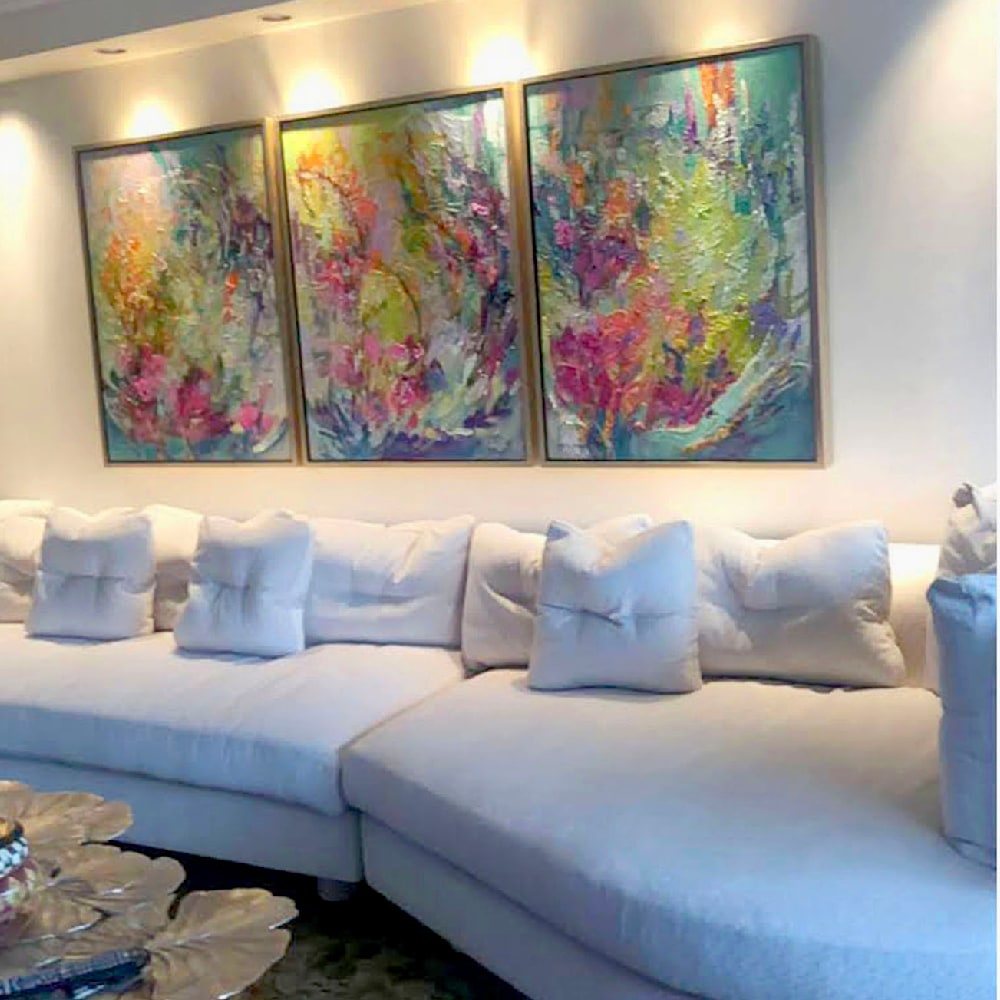 Grace triptych
She may tell a story sparked by a painting. As she speaks, I may see images flipping through my mind’s eye. In the days after our first conversation, I may feel inspired to finish a painting that has been sitting in the studio for months. How does this magic happen? Why is painting not a straight line direct start to finish endeavor?
In GRACE above, Amy called about a triptych floral for her new living room. I happened to be finishing up a floral abstract in the studio, and was able to finish it with her in mind. We framed it in a German silver float frame and had it shipped to her in New York.
 Tango in the Heartland
Emotions flow in spurts. Like a heartbeat, resting in between each ~ the pause is just as important as the stroke. More and more, I incorporate this into my creative process, working on many canvases, waiting for the flow of the colors/emotions for each to be clear. Layers of ethereal light, vibrant strokes of thick impasto paint, carved with palette knife drawings ~ dreams, memories, emotions, past, present, future ~ merge ~ interwoven in a new structure.
 Butterfly Garden
While many viewers search for a horizon line to orient themselves in the art, sometimes a work of heART helps us reorient ourselves. Seeing the light within us and others through my art has changed my horizons. In fact, many of my paintings no longer contain obvious horizons, no destination, no place to go. Rather ~ an invitation to explore the depths of your heart.
 Heartland Meadow (Among Butterflies)
Explore your heart colors with me. If you are moving to a new home, transitioning to a new chapter of life, or wishing to deepen your own wellness/vitality ~ Schedule a Consult with me.